Data organisation

The data is in, the hours in the lab or in the field are over, and it’s time to tackle the statistical analysis of your data. But how to organise the data or notes or papers that form the core of the evidence for your research question?

As is so often the case, the answer could well be “it depends”. It depends little bit on what questions you want to ask your data, and it depends a little bit on what software you will use to extract summary statistics from that data.

However there are some basic principles that apply broadly to converting a pile of data into a spreadsheet ready for a variety of statistical analysis.

  1. Use Excel to enter your data. An Excel spreadsheet is flexible and can be read by many statistical analysis packages. You may not (indeed probably will not!) end up using Excel for the statistical analysis itself, but a .xls or .csv file is a portable and compact format for your data in the first instance.
    • If there is only one data set, put it in the first worksheet, easy to see.
    • Put your description of the study and data dictionary in Sheet 2. Then the information stays with the data and is also easy to find.
    • If there two or more data sets, use separate files, or separate sheets. This will be how they are read into other software for analysis.
    • Do not include graphs, charts, summary tables on the same sheet as the data. Other stats packages will not be able to read graphs or charts, and summary tables won’t be in the same format as the rest of the spreadsheet.
       
  2. Use one row of the worksheet for each subject in your data collection. For human studies, this is likely to mean one row per person. In biological experiments, one row per sample.
     
  3. Give an ID number to each subject. This will help for tracking subjects down later if you re-order the rows of the spreadsheet.
     
  4. Use one column for each characteristic measured on each experimental unit (e.g. sex, height). These are called variables.
     
  5. Make column names:
    • Brief and informative. Try not to leave them as Q1, Q2, Q3 and so on. Some of us learnt data entry when variable names could only be 8 characters long and so brevity was forced on us! This is no longer the case, but on the other hand if the column name is “What is your usual address or residence whether owned by you or rented” that’s going to be hard to read in tables and graphs. Use the data dictionary on Sheet 2 to remind you of the full definition.
    • With no spaces or other special characters. This will make it easier to read your spreadsheet in to different stats packages.
    • Lower case, for ease of typing. With predictive text and copy-paste this is probably less important than it used to be.
    • Consistent across different data files and sheets. This is important! You (or your statistical collaborator) will not thank you if the variable is called Gender in one spreadsheet, gender in another and GENDER in a third!
       
  6. Use only one Excel row for column names. Again, this will make it easier to read your spreadsheet in to different stats packages which will expect variables names to only occupy one row.
     
  7. Factor levels within a column can be names or numbers, such as 1, 2, 999 or “Yes”, “No”, “Unsure”.
    • If using names, make them brief and informative. Check your typing, indeed it might be easier to use lower case for factor levels e.g. “yes”, “no”, “unsure”.
    • Explain the names or numbers in the data dictionary. That’s the information on Sheet 2.
       
  8. Leave no blank cells in the worksheet by:
    • Explicitly coding missing values. By default, R uses NA as a missing value indicator, GenStat uses *, SPSS uses a dot (.). There are exceptions to this rule but as a general rule of thumb it’s a good idea to fill in all the blanks so you can see where the missing values occur. Your statistical collaborator will be able to advise on alternatives.
    • Downfilling cell contents where they are the same for successive subjects.
       
  9. If your data set includes any calculated variables, also include the variables from which they were calculated. For instance, you might have calculated BMI from height and weight, so leave the height and weight in. Or you might have split a numeric column into three parts – below normal range, in normal range, above normal range. Keep the original numbers there so that if you change your mind about where to put the splits, you can easily do that.
     
  10. Proofread your data before handing it on to other collaborators.
    • Columns containing numbers – use histograms, scatterplots, or boxplots to check the values you have typed in. Don’t forget to delete the charts before you finish (see point 1)!
    • Columns containing factors – use tables or barcharts.

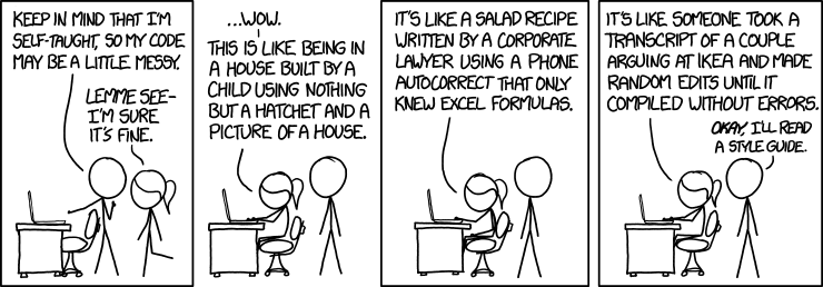
You may have seen this cautionary tale about what can happen if you don’t do all of these things – it’s well worth linking to here!

A short version of these guidelines is also available here.

Associate Professor Alice Richardson is Lead of the Statistical Support Network at the Australian National University. Her research interests are in linear models and robust statistics; statistical properties of data mining methods; and innovation in statistics education. In her role at the SSN she applies statistical methods to large and small data sets, especially for research questions in population health and the biomedical sciences.

Tricky words in Statistics: lexical ambiguity

With a name like mine, it was easy when I was growing up to love reading Alice in Wonderland and Alice through the Looking Glass by Lewis Carroll. In that second book Alice encounters Humpty Dumpty and the conversation goes like this:

“ ‘When I use a word,’ Humpty Dumpty said in rather a scornful tone, ‘it means just what I choose it to mean — neither more nor less.’

’The question is,’ said Alice, ‘whether you can make words mean so many different things.’

’The question is,’ said Humpty Dumpty, ‘which is to be master — that’s all.’ ”

Which brings me to the concept of lexical ambiguity – the notion that, as Alice says, you can make words mean so many different things.

This is never more true than in English. I’m thinking words such as “mean” itself, “normal” and most slippery of all, “significant.”

The thing is, a word like “normal” can have one meaning in general English, the English of general conversation, and quite another in mathematical or even statistical English. In general English normal can mean usual, typical, or expected. We talk about things like a “normal” range for a cholesterol level, for example, when that level is what is expected for a healthy person. In mathematical English, the term “normal” refers to a line which is at right angles to a point on a curve. You may remember learning about this line in high schools maths, along with its slightly better known companion, the tangent. Somehow going off at a tangent is a phrase that has made it into general English while going off at a normal is not so common! And in statistical English, the word “normal” refers to a distribution which is symmetric and kind of bell-shaped, indeed a shape sometimes known as a bell curve.

“Mean” behaves in a similar way. In general English mean can refer to the character of a person, heartless or cruel. It can also refer to the definition of something, as in “To procrastinate means to put off doing a task until later”. And in statistical English, “mean” refers to a measure of the centre or location of a set of data, calculated by adding up the data values and dividing by the number of data values you have.

“Significant” is a more slippery customer because the statistical meaning is very specific, or at least it should be. In general English significant means important, or large, or noteworthy. But in statistical English it has a very specific definition, related to testing hypotheses. The outcome of a hypothesis test is significant if the outcome is unlikely to have occurred by chance. How unlikely is unlikely? The bar is usually set at 5 percent, so that if an outcome has a less than 5 percent probability of occurring purely by chance, then the outcome is deemed to be statistically significant.

So statistical English can start to sound rather repetitive because of the specific meanings attached to various words. This is to be expected, indeed it’s quite normal (in the general English sense of the word!) and so there’s no need to go hunting around for alternatives to “significant” if that’s how the test turned out. Some researchers take care to separate out the concepts of statistical significance and practical significance. Just because the difference between two groups turns out to be statistically significant, doesn’t mean that there’s any practical significance in the difference. This is particularly important to remember in the context of trials of new health treatments. There may be a significant difference between the new drug and the old one in statistical terms, but in practical terms the effect of the drugs is identical. The new drug is unlikely to be approved on the basis of a statistical significance alone.

Now you know about lexical ambiguity, what to do about it? Lists of lexically ambiguous words are available in the statistics education literature. You could figure out how they relate to terms in a language familiar to you if that language is something other than English.

You could familiarise yourself with appropriate usage of these words by listening to experts in statistical analysis speak about their work, and reading their results.

Finally, you can write and speak them yourself so that you feel confident when you’re using an appropriate turn of phrase, even if it sounds a little awkward at first.

If you follow these suggestions then like Humpty Dumpty, you too can be master of all these lexically ambiguous terms!

Associate Professor Alice Richardson is Director of the Statistical Consulting Unit (SCU) at the Australian National University. Her research interests are in linear models and robust statistics; statistical properties of data mining methods; and innovation in statistics education. In her role at the SCU she applies statistical methods to large and small data sets, especially for research questions in population health and the biomedical sciences.

Statistical significance, p-values and replicability

Still carrying on about p-values? Yes absolutely!

It runs out that some have interpreted the American Statistical Association’s statement on p-values as official ASA policy, on the one hand; and on the other hand, as statisticians abandoning p-values entirely.

That’s not what was intended, writes Karen Kafadar, President of the ASA and Editor-in-Chief of the Annals of Mathematical Statistics. So she has brought together a Task Force who have released a statement too, in the Annals of Mathematical Statistics in mid-2021.

At just two A4 sides, the Task Force report is much shorter than the first statement on p-values, especially if you consider the pile of articles that accompanied that first statement in the American Statistician. Kafadar has also written a three-page Editorial in the Annals to go with the new statement.

The first point of the new Statement is a no-brainer for statisticians – that “capturing the uncertainty associated with statistical summaries is critical.”

The second one also makes a huge amount of sense – “dealing with replicability and uncertainty lies at the heart of statsitical science”.

Third, “the theoretical basis of statistical science offers several general strategies for dealing with uncertainty.” Most of the time the strategies devolve to just two. The first is the frequentist approach with p-values, confidence intervals and predictions intervals. The second is the Bayesian approach with Bayes factors, posterior probability distributions and credible intervals. If these two sound like they’re not all that radically different, well you’re not wrong. Several of the papers in the American Statistician collection mentioned above proposed replacing p-values with Bayes factors of variations thereon. In a sense one tool for decision making would be replaced with another. Maybe the Bayesian approach has fewer opportunities for mistaken logic, but the fact remains that for each frequentist method there is a Bayesian equivalent.

Which leads on to the fourth point in the statement, “thresholds are helpful when actions are required”. Bayesians too can set a value of a Bayes factor which would lead them to decide that this therapy is better than that or that, or whatever is required.

Fifth and last, “In summary, p-values and significance tests when properly applied and interpreted, increase the rigour of the conclusions drawn from data.” Totally agree! It’s all the caveats in that statement that make it so hard to implement fully, which I think means it’s still quite understandable that former Statistical Society of Australia President, Adrian, Barnett, swore off p-values for an entire year (I hope it’s going well!)

Anyway, let’s see over the next few months how much traction the Task Force statement gains in the research community.

Associate Professor Alice Richardson is Director of the Statistical Consulting Unit (SCU) at the Australian National University. Her research interests are in linear models and robust statistics; statistical properties of data mining methods; and innovation in statistics education. In her role at the SCU she applies statistical methods to large and small data sets, especially for research questions in population health and the biomedical sciences.

What’s going on with p values?

You could be forgiven for feeling a bit confused about the most appropriate way to summarise the statistical results of your research. Seems like in the past a p-value was all you needed. If p < 0.05, hooray! Significant result, paper published. If p > 0.05, misery! Non-significant result, paper pushed into bottom of filing cabinet. But nowadays, it’s not as simple any more.

Where did the notion of the magic 0.05 defining success and failure come from? The trails mostly end up with R.A. Fisher in his book “The Design of Experiments.” What he actually wrote was “The value for which P=0.05, or 1 in 20, is 1.96 or nearly 2; it is convenient to take this point as a limit in judging whether a deviation ought to be considered significant or not. Deviations exceeding twice the standard deviation are thus formally regarded as significant.” The value he is referring to here, the 1.96, is the spot on a standard normal distribution which has 2.5% of the distribution above it, and 2.5% of the distribution below -1.96.

And that’s it! It’s not at all clear if he intended the research community to grab hold of this rule of thumb and run with it quite as far and quite as fast as it did.

Actually there have been rumblings about the misinterpretation of p values for almost as long as there have been p values. The references to the ASA statement show that papers with this message started to appear in the 1960s. The popular science media has been printing articles about this on a regular basis for the last 10 years or so.

Even the cartoonists have got in on the act: you can find one here and there are plenty more to entertain you. Try PhDcomics.com and xkcd for lots of light relief during your research.

Then there was the highly publicised and controversial move in 2015 by the Journal of Basic and Applied Psychology to ban all p values from their published journal articles. Next came the American Statistical Association’s statement on p values, published in 2016. This is the first time that the ASA has put out a statement on a specific statistical practice, so it’s not to be taken lightly. The original article containing the statement comes with supporting comments from 25 eminent statisticians.

The ASA article about the statement opens with a statement of the essential paradox underlining why p-values continue to persist. It goes like this:

Q: Why do so many colleges and grad schools teach p = .05?

A: Because that’s still what the scientific community and journal editors use.

Q: Why do so many people still use p = 0.05?

A: Because that’s what they were taught in college or grad school

And what exactly is a p-value anyway? The statement starts with this (informal) definition: “Informally, a p-value is the probability under a specified statistical model that a statistical summary of the data (for example, the sample mean difference between two compared groups) would be equal to or more extreme than its observed value.”

Six principles govern the use of the p-value according to the ASA statement.

P-values can indicate how incompatible the data are with a specified statistical model.

This is the principle underlying what is likely to be your intuition about p-values: the smaller they are, the more incompatible your data is with the hypothesis (i.e. specified statistical model) about the data that you are testing.

P-values do not measure the probability that the studied hypothesis is true, or the probability that the data were produced by random chance alone

This is the big one when it comes to misinterpretation of p values. If I had $1 for every time a first year student told me this is what p values, measure, I would be a wealthy person indeed! It’s very tempting, of course, to say that a small p value means that there’s a small chance of my hypothesis being true, but a quick glance back at the informal definition shows that the temptation misses the mark in a couple of ways. Firstly, the definition involves an assumption that the hypothesis is true, not a test of whether it is or not. Secondly, the statement to which a probability is attached is not to do with the hypothesis, but to do with the data, summarised in the form of a test statistic. It’s subtle, to be sure, but important as well.

Scientific conclusions and business or policy decisions should not be based only on whether a p-value passes a specific threshold.

It’s true that many statistical analyses do end in a conclusion being drawn or a decision being made. The point of this principle is that the big picture needs to be taken into account, which includes all the decisions leading up to the calculation of the p-value. The cost of a decision is also important in practical situations, along with the cos of making a mistake such as declaring a result to be significant when in fact it’s not.  

Proper inference requires full reporting and transparency

This principle follows on nicely from the one before – the notion that the full process of data collection, cleaning and model selection should be part of a researcher’s reporting, not just a single number.

A p-value, or statistical significance, does not measure the size of an effect or the importance of a result.

Quite so – we have a whole range of effect size statistics that measure the size of an effect. Have another look at the definition – there’s nothing there about the practical significance, only the statistical significance.

By itself, a p-value does not provide a good measure of evidence regarding a model or hypothesis.

It should be unusual for a data analysis to finish with a p value. In particular, a large p-value (p > 0.05) need not be the end of the story. The particular model you fitted didn’t show a statistically-significant effect for some variable … but maybe some other model, with some other variables, would show a statistically-significant effect.

So what to do? Keep an eye on the culture in your discipline – is it moving away from p-values and towards the simultaneous reporting of a point estimate and confidence interval? Keep the definition of a p-value firmly lodged in your memory, so that you lessen the risk of the tempting misinterpretations. And keep the contact details of your local statisticians close by too. They are happy to advise on the statistical aspects of your project from the beginning design phases right through to the detailed reporting and correct interpretation of results.

Associate Professor Alice Richardson is Director of the Statistical Consulting Unit (SCU) at the Australian National University. Her research interests are in linear models and robust statistics; statistical properties of data mining methods; and innovation in statistics education. In her role at the SCU she applies statistical methods to large and small data sets, especially for research questions in population health and the biomedical sciences.

STRengthening Analytical Thinking for Observational Studies

It’s an alphabet soup out there for researchers looking for guidelines to follow in their chosen style of research. Depending on your discipline, you may have come across some of these already. There’s CONSORT for randomised trials, STROBE for observational studies, PRISMA for systematic reviews, and ARRIVE for animal research, to name but a few.

Indeed the EQUATOR network links to over 400 such guidelines for reporting health research alone. In this post I’m going to dive into one of the newer initiatives for observational studies, with acronym STRATOS.

If observational studies are the common data collection methodology in your discipline, then you’ll be aware that the validity of such studies depends critically on good study design, excellent data quality, appropriate statistical methods and accurate interpretation of results. Statistical methodology at the heart of this pipeline has developed substantially in recent times, and an efficient way to keep up with methodological developments in observational studies is through the STRATOS Initiative: STRengthening Analytical Thinking for Observational Studies.

The STRATOS initiative is closely connected to the International Society of Clinical Biostatistics (ISCB) and was launched at the ISCB meeting in Munich in August 2013. The initiative has at its core a number of topic groups, each of which addresses an important aspect of the design and analysis of observational studies. Those topics are: missing data, selection of variables and functional form in multivariable analysis, initial data analysis, measurement error and classification, study design, evaluating diagnostic tests and prediction models, causal inference, and survival analysis. Let’s look at some of these in turn.

Missing data

Missing data are impossible to avoid in observational studies, and the simple solution of restricting the analyses to the subset with complete records will often result in bias and loss of power. The seriousness of these issues for resulting inferences depends on the mechanism causing the missing data and the nature of the research question, as well as the model to be used to answer the question. The literature on methods for the analysis of data with missingness has grown substantially over the last twenty years, and if you’re interested in reading more on the topic of missing data, try Sterne et al (2009), the titles below or click here.
Molenberghs G; Fitzmaurice GM; Kenward MG;   Tsiatis AA; Verbeke G. Handbook of Missing Data Methodology. CRC Press: New York, 2014.
Carpenter JR; Kenward MG. Multiple Imputation and its Application. John Wiley & Sons Ltd: Chichester, 2013.

Selection of variables and functional forms in multivariable analysis

In a multivariable analysis, it is common to have a mix of binary, categorical (ordinal or unordered) and continuous variables. Often the aim of a statistical analysis is to gain insight into the individual and/or joint effect of multiple variables on an outcome. Two interrelated challenges are selection of variables for inclusion in an explanatory model, and choice of the form of the effect for continuous variables. There have been many suggested model building strategies each with their own advantages and disadvantages, and if you’re interested in reading more, try Greenland (1995), the titles below or click here.
Harrell FE. Regression Modeling Strategies: with applications to linear models, logistic regression, and survival analysis. Springer: New York, 2001.
Wood S. Generalized Additive Models. Chapman & Hall/CRC: New York, 2006.

Initial data analysis

Initial data analysis consists of all steps performed on the data of a study between the end of the data collection/entry and start of those statistical analyses that address research questions. Shortcomings in these first steps may result in inappropriate statistical methods or incorrect conclusions. Metadata setup, data cleaning, data screening and reporting are all important parts of initial data analysis. If you’re interested in reading more, try Huebner et al (2016), the title below or click here.
Cook D, Swayne DF. Interactive and dynamic graphics for data analysis. Springer: New York, 2007.

Measurement error and misclassification

Measurement error and misclassification in predictors and responses occurs in many observational studies and some experimental studies. It turns out that measurement error and misclassification in predictors can result in biased parameter estimates and a loss of statistical power. If you’re interested in reading more, try the titles below or click here.
Buonaccorsi JP. Measurement Error: Models, Methods, and Applications. Chapman & Hall/CRC: Boca Raton, Florida, 2010.
Carroll RJ, Ruppert D, Stefanski LA, Crainiceanu CM. Measurement Error in Nonlinear Models: A Modern Perspective, Second Edition. Chapman and Hall/CRC Press: Boca Raton, Florida, 2006.
Gustafson P. Measurement Error and Misclassification in Statistics and Epidemiology. Chapman&Hall/CRC: Boca Raton, Florida, 2004.

Causal inference

The desire to draw causal inference from observed associations is age old, and the ensuing quest has contributed greatly to scientific progress. While simple association models have gradually gained in sophistication and their potential is typically well understood by researchers and statisticians, causal questions and answers need an extra dimension of abstraction which calls for special care. The move from association to causation is by no means trivial and requires assumptions not only about the observed data structure, but also beyond the sampled data. If you’re interested in reading more, try Pearl (1995), the title below or click here.
Pearl J, Mackenzie D. The Book of Why. Allen Lane: London, 2018.

High dimensional data

The increasing availability and use of “big data”, characterized by large numbers of observations and/or variables, has created both challenges in data handling and opportunities for the development of novel statistical methods and algorithms. Data may be represented in many different forms and derive from multiple sources. Unique opportunities exist to leverage these large databases to support programs in comparative effectiveness and health outcomes research. At the same time, advances in statistical methodology and machine learning methods have been contributed to improved approaches for data mining, statistical inference, and prediction in the high dimensional data setting.

As well as these nine groups, STRATOS has eleven cross-cutting panels. Some of them deal with internal issues such as membership and publications, but two are of more general interest. I’ll list them here.

The Simulation panel recognises the fact that simulation studies will remain a key instrument to systematically assess competing statistical methods and to create solid evidence. Applied researchers can be empowered by better understanding the concepts regarding interpretation of simulation results, leading to more appropriate methodological choices and more powerful study conclusions.

And finally, the Visualisation panel recognises that visualization and the use of graphics can help at every stage of an analysis, from the planning and design of an experiment, the very first data explorations, through to the communication of conclusions and recommendations. Visualization is more than “plotting data”; it can lead to a deeper understanding and inform next steps. The role of the STRATOS visualization panel is to promote the use of good graphical principles for effective visual communication, providing guidance and recommendations covering all aspects from the design, implementation and review of statistical graphics.

Associate Professor Alice Richardson is Director of the Statistical Consulting Unit (SCU) at the Australian National University. Her research interests are in linear models and robust statistics; statistical properties of data mining methods; and innovation in statistics education. In her role at the SCU she applies statistical methods to large and small data sets, especially for research questions in population health and the biomedical sciences.

In defence of probability sampling

“By a small sample we may judge the whole piece.”
Miguel de Cervantes (1547-1616).

So you plan to run a survey as part of your quantitative research? How are you going to select your sample? If you haven’t thought much about this, it’s important to realise that sampling strategies matter quite a lot. If your goals are to better understand the characteristics of the population you are sampling, then there are certain sampling strategies you may want to avoid.

Sampling populations has a long history, but the theory that enables one to estimate population characteristics and standard errors from a sample goes back to the early and mid-20th century. Random selection of participants is an essential element of survey sampling. The main idea is to draw a sample in which the probability of selection is known. This technique is called probability sampling. This is a powerful idea that has a natural application in political polling (where one ultimately can check the surveyor’s best guess), but also across all social research.

Good research demands good research tools. But in spite of the scientific rigour behind probabilistic sampling, many academic researchers opt to collect data from a non-probability sample, and treat it as if it were representative of the population. You may be familiar with non-probability sampling: convenience sampling, snowball sampling, quota sampling, or passive sample where respondents self-select are some examples. Sampling friends, co-workers, or people you meet on a street corner are examples of convenience sampling. In snowball sampling, the first respondent refers a friend, who refers another friend etc. In quota sampling, a quota is established (e.g. 20% smokers) and researchers are free to choose any respondent they wish as long as the quota is met. All such methods are like to produce biased samples because researchers may approach some kinds of respondents and avoid others. Collection methods that allow the respondent to self-select are notoriously biased, and are very unlikely to produce a representative sample. More importantly, non-probability sampling techniques cannot be used to infer from the sample to the general population. There is simply no mathematical basis for inference. The non-probability sample can only be said to represent itself, and nothing more.

The advantage of non-probability sampling over probability sampling is the ease of data collection. At the end of each process, one has a set of samples that can be “analysed” using a statistical software package. In both cases, the analyst may infer population characteristics, propose new theories, or propose policy. However, there are no justifiable grounds for drawing generalisations from studies based on non-probability samples. Treating a convenience sample as if it were representative of the study population is simply bad research.

Government statistics organisations, polling organisations, and reputable market research organisations use sound statistical practices for sampling populations. Their reputations depend on it. In this current Information age, serious researchers owe it to their discipline to produce reliable data using sound statistical methods.  Fortunately, access to information about good statistical methodology is free and available to ANU researchers. Statisticians at the Statistical Consulting Unit are still flying the flag for probability sampling.

Learn about good sampling techniques. Visit your local statistician at the Statistical Consulting Unit at the ANU! https://scu.anu.edu.au/request_consultation

I’ve listed a few useful references for further study.

Dorofeev S., Grant P.  Statistics for Real-Life Sample Surveys: Non-Simple-Random Samples and Weighted Data. Cambridge University Press (2006).

Lucas, SR. An Inconvenient Dataset: Bias and Inappropriate Inference in the Multilevel Model. Quality & Quantity, 48: 1619-1649. (2014).

Thompson S., Sampling. Wiley Series in Probability and Statistics  (2012).

Valliant R., Dever J., Kreuter F., Practical Tools for Designing and Weighting Survey Samples  Springer Series in Social and Behavioural Sciences (2013).

Marijke joined the Statistical Consulting Unit in May 2019. She is passionate about explaining statistics, especially to those who deem themselves not statistically gifted.

Translating your data for understanding #AcWriMo

November is Academic Writing Month at ANU. No better time thus to put the translation process of data to words in the spotlight.

“The secret language of statistics, so appealing in a fact minded culture, is employed to sensationalise, inflate, confuse, and oversimplify. Statistical methods and statistical terms are necessary in reporting the mass data of social and economic trends, business conditions, “opinion” polls, the census. But without writers who use the words with honesty and understanding and readers who know what they mean, the result can only be semantic nonsense.”

From: How to lie with Statistics – Darrell Huff (Chapter 1, p. 10)

This rather cynical quote points to the responsibility of any academic author, whether it is a thesis or a journal paper, to ensure that their writing is with the reader’s understanding in front of mind. At the same time, they should never loose sight of the objectivity and preciseness required to fulfil the integrity of the scientific process.

More specifically, when writing down the statistical methods and results section of an academic piece, a few of the goals that we aim for are: (1) reproducibility, (2) objectivity and clarity, and (3) preempt misunderstanding.

Reproducibility

In the context of academic writing, reproducibility refers to the ability for an independent reviewer/researcher to replicate the reported results based on the information provided in the paper.

Writing reproducible methods starts with conducting reproducible analyses. The National Academy of Sciences has published several guides to aid this process but a good starting point would be to document every single step of the analysis process. For science researchers, this would be akin to maintaining a lab book. In essence, it is a record of every data manipulation and calculation that was performed before obtaining the end result.

Statistical software can be of great help here. By avoiding copy/paste or point-and-click processes, but instead utilising the syntax or coding functions of the software you have an immediate record of all the steps performed during the analysis process. Ideally, this code will include every manipulation and estimation that were performed on the raw data.

Source: xkcd

Objectivity and clarity

“The real purpose of the scientific method is to make sure nature hasn’t misled you into thinking you know something you actually don’t know.”

Robert Pirsig, Zen and the Art of Motorcycle Maintenance

When reporting statistics your field of research or intended journal for publication will typically have guidelines as to what exactly needs to be reported. In general, the common rule would be that as a writer you need to report all the numbers required for a reader to have a full picture and enable them to draw their own conclusion.

For example, when reporting p-values you could simply go with stating whether a p < 0.05 or p > 0.05, indicating that you have evaluated the actual number against an arbitrary threshold. However, you rob the reader of the more precise information on the exact p-value.

Of course, often p-values have too many decimals which would hamper the flow to the text. But a good practice would be to always report exact p-values up to 3 decimals and when a p-value is too small, state p < 0.001. This way you compromise between the flow of your writing whilst maintaining the objectivity and clarity of your writing.

As a side note, it would be even better practice to accompany your p-values with supporting statistics of which the p-value was derived, as well as confidence intervals and/or effect sizes where appropriate.

Preempt misunderstanding

“… When we reason informally – call it intuition, if you like – we use rules of thumb which simplify problems for the sake of efficiency. Many of these shortcuts have been well characterised in a field called ‘heuristics’, and they are efficient ways of knowing in many circumstances.

This convenience comes at a cost – false beliefs – because there are systematic vulnerabilities in these truth-checking strategies which can be exploited. …”

From: Bad Science – Ben Goldacre (Chapter 13: Why clever people believe stupid things)

Everyone of us comes with their own set of beliefs. As a writer it is important to be conscious and open about your own set of beliefs. Simultaneously, you will need to have an understanding of your readers’ beliefs as conflicting belief systems may lead to incompatible interpretations.

When your writing is reproducible and objective, you have already taken important steps towards avoiding your research being misunderstood as the reader has all the necessary tools to draw their own conclusions. When your conclusions are supported by the data and your statistical analyses are sound, your readers will inevitably concur.

Avoiding misunderstanding also relates to the description of the statistical methods you used. All too often we see papers in which well-known statistical analysis techniques are referred to by their software name, or more obscure statistical analyses are not well referenced or justified. Readers will have confidence in your results when they belief that those results were obtained in the most appropriate way.

As a word of caution though, belief systems come also into play when selecting statistical methods for data analysis and while there is often more than one way to analyse your data, not every single method is always appropriate. But that is probably leading us too far from the writing aspect.


For further reading on how to translate your data for understanding, check out this post by The Writing Center and this online video tutorial.


The Statistical Consulting Unit values research integrity and we see writing as an integral part of that through appropriate representation of statistical analyses and results.


Marijke joined the Statistical Consulting Unit in May 2019. She is passionate about explaining statistics, especially to those who deem themselves not statistically gifted.

Speaking statistics: a short dictionary

Last month we discussed that learning the language of statistics is crucial to communicating your research. Now is the time to look a bit more closely at some ambiguous terms that are often thrown around in conversations on analysis of research data. Obviously, this is not an exhaustive list and if you would like to check out some other statistical dictionaries, the Oxford reference and the UC Berkeley Glossary of Statistical Terms are good starting points.

Kaplan et al. (2009) have published a table of 36 lexically ambiguous words, of which they discuss five in more detail in their paper. I randomly selected another 5 to put under the looking glass here.

Bias

In English, bias refers to the inclination or prejudice for or against one person or group, especially in a way considered to be unfair. In the context of dressmaking it means a direction diagonal to the weave of a fabric (e.g. a silk dress cut on the bias). 

In statistics, bias refers to a systematic as opposed to a random discrepancy between a statistic (estimated from the data) and the truth (expected in the population). So, put simply, a measurement procedure is said to be biased if, on average, it gives an answer that differs from the truth. Statistical bias can be unknown, unintended or deliberate. Whilst often undesired, there is no specific negative statistical connotation as there is in English.

Error

When somebody makes an error, it’s commonly understood as making a mistake. In statistics, an error (or residual) is not a mistake but rather a difference between a computed, estimated, or measured value and the accepted true, specified, or theoretically correct value. The error often contains useful information around distributional assumptions and model fit. 

We also often talk about Type I and Type II errors. These errors result from hypothesis testing where the hypothesis conclusion does not align with the underlying truth. In this context, the error is indeed a “mistake”. A Type I error occurs if the null hypothesis is rejected when in fact it is true (i.e. false positive), while a Type II error is not rejecting a false null hypothesis (i.e. false negative). 

Mode

The English dictionary defines mode as a manner of acting or doing, or a particular type or form of something. It can also be a designated condition or status, as for performing a task or responding to a problem (e.g. a machine in the automatic mode). In philosophy, a mode is an appearance, form or disposition taken by a thing, or by one of its essential properties or attributes. While in music, mode refers to any of various arrangements of the diatonic tones of an octave, differing from one another in the order of the whole and half steps.

In statistics the mode is a measure of central tendency and it is the value that appears most often in a set of data values. The numerical value of the mode is the same as that of the mean and median in a normal distribution, and it may be very different in highly skewed distributions. While the mean can only be calculated for continuous data, the mode applies to all data scales including nominal and ordinal data.

Null

Null means without value, effect, consequence or significance. In law, it refers to having no legal or binding force. In electronics, it is a point of minimum signal reception, as on a radio direction finder or other electronic meter. In mathematics, the word null is often associated with the concept of zero or the concept of nothing. And it is probably this association which drives the misconception that the statistical null hypothesis is by definition a test against 0. However, a null hypothesis is a type of conjecture used in statistics that proposes that there is no difference/relationship between certain characteristics of a population or data-generating process. 

Significant

Something significant in English indicates that it is sufficiently great or important to be worthy of attention. In research the term statistically significant is used when the null hypothesis is rejected with a sufficiently small p-value. The confusion arises when a statistically significant result is advertised as being significant (i.e. important) and meaning is attached to the size of the p-value. Lots of ink has flown over the pros and cons of this process and the misconceptions arising. But as a principle, you as a researcher will need to keep in mind that a statistically significant effect does not equal by definition an important effect. 

From experience when talking to clients, I would like to add two more words to this list that are often quite confusing because they indicate different things in different areas or even software.

Factor

In English a factor can be a circumstance, fact, or influence that contributes to a result. In mathematics t is also a number or quantity that when multiplied with another produces a given number or expression. In statistics a factor can take on different meanings depending on the context. In an experiment, the factor (also called an independent variable) is an explanatory variable manipulated by the experimenter. In a broader context, especially in software packages like SPSS and R, a factor refers to an independent categorical variable. In factor analysis, a factor is a latent (unmeasured) variable that expresses itself through its relationship with other measured variables. The purpose of factor analysis is to analyse patterns of response as a way of getting at this underlying factor. 

Covariate

Covariate does not necessarily have a specific meaning in English but in statistics two connotations are attached to it. Note that mathematically there is no distinction between the two interpretations. 

Covariates are often used to refer to continuous predictor variables. SPSS is particularly guilty of that. However, in its original sense a covariate is a control variable. And sometimes researchers use the term covariate to mean any control variable, including controlling for the effects of a categorical variable. In SPSS however, you would enter your categorical covariate as a fixed factor. Still following?

At the end of the day, lexical ambiguity can be resolved by being careful in setting up hypotheses, running analyses and interpreting results. This requires knowledge of the language as well as an understanding of the context in which you are applying statistics. Just like Rome wasn’t built in one day, these are just baby steps in the right direction. Through interaction with peers and experts, you will find your way and develop your statistical language.

References

Kaplan, J.J., Fisher, D.G., and Rogness, N.T. (2009). Lexical ambiguity in statistics: what do students know about the words association, average, confidence, random and spread? Journal of Statistics Education 17(3).

Marijke joined the Statistical Consulting Unit in May 2019. She is passionate about explaining statistics, especially to those who deem themselves not statistically gifted.

Speaking the language of statistics

When you think of statistics, do you associate it with equations, mathematics and complex formulae? Have you also realised that there is a whole language associated with the area?

Learning and using statistics requires you to understand the language of statistics (Dunn et al. 2016). And let’s be honest, this language can sometimes be confusing as it borrows words from general English and mathematics. Often though, words have a very specific statistical meaning that may or may not correspond to their more popular meaning. This has been conned lexical ambiguity.

To make it even more difficult, the language of statistics is not even close to being standardised. Depending on the context or field of research, statistical terms can have acquired different definitions. This can make it particularly confusing for someone who is new to statistics or for an experienced researcher who starts working in a multidisciplinary team. These linguistic challenges can contribute to statistical anxiety, which we covered earlier this year.

For example, from Dunn et al., the word sample:

“In statistics, a sample is a set of observations drawn from a population. In business, however, a sample is a free small quantity of product and in biomedicine a sample is a single specimen (of blood, urine, etc.) rather than a set of observations.”

Similar to one word having different meanings, one concept can also be described by multiple words that are often used interchangeably. For example, linear mixed models are also known as mixed effects models, multi-level models, longitudinal models, etc. Each of these terms will be embedded in a particular field or software package. The challenge for those unfamiliar with the area is to recognise that these terms all refer to a similar model (note that there are slight nuances possible from a theoretical point of view).

Now, don’t be encouraged by these complexities. The key is to be informed and aware of lexical ambiguity. Just as with normal communication, when talking statistics, you will need to be conscious that the message that you are conveying is being interpreted as you intended by the receiver. Talking and understanding statistics will enable you to communicate clearer with your peers, supervisors and statistical consultants.

Next month we will look in a bit more detail at some of those lexical ambiguous terms. But for the time being, do not hesitate to ask clarification if you do not understand a term or are unsure about its exact meaning. Especially when you are communicating with the Statistical Consulting Unit. Our mission is to make you understand statistics better and we can only do that when we, consultants and researchers, are conscious of the meaning and understanding of our statistical language. And when something is not clear, clarification should be sought and encouraged.

References

Dunn, P.K., Carey, M.D., Richardson, A.M. and McDonald, C. (2016). Learning the language of statistics: challenges and teaching approaches. Statistical Education Research Journal 15, 8 – 27.

Marijke joined the Statistical Consulting Unit in May 2019. She is passionate about explaining statistics, especially to those who deem themselves not statistically gifted.

Six things to bear in mind when performing multiple imputation

We are honoured this month to have a guest blog from Nidhi Menon.

Nidhi is a Biostatistician within BDSI, supporting the Health Analytics Research Centre (HARC), a collaboration between ACT Health and its academic partners focused on health data science and research methods as well as analytics in both qualitative and quantitative areas.

Her PhD was centered around the mystery of missing data and the role of multiple imputation to try to resolve this. We hope her valuable insights will help you appreciate the complexity of the problem.

Multiple imputation (MI) has recently become an extremely popular approach when missing data. One big reason for this is that once missing values have been imputed and imputed datasets have been generated, these can be easily analysed using standard statistical analysis, by pooling the estimates using Rubin’s rules. Additionally, by incorporating MI in statistical software, imputation has now become an easy solution for missing data! Multiple Imputation can be very useful to handle missing values if done correctly, however it is equally dangerous if performed incorrectly. In this blog, we touch upon six key factors to bear in mind when performing Multiple Imputation. 

Figure: Illustration of the multiple imputation process

1) Mechanism of Missingness

Broadly missing data mechanisms can be categorised as Missing completely at random (MCAR), missing at random (MAR) and missing not at random (MNAR). 

Data is said to be missing completely at random (MCAR) if the probability of a value being missing is unrelated to the observed and missing data for that unit. This means that regardless of the observed values, the probability of missing is the same for all units. Data is said to be missing at random (MAR) if the probability of missingness depends on the observed values but not the missing values. The standard implementation of MI depends on the Missing at Random (MAR) assumption. Finally, if the MAR assumption is violated, then the data is said to be missing not at random (MNAR). 

If the data is MCAR, then both MI and available case analysis are valid methods of analysis and produce unbiased results. If the data are MAR, then MI is a better approach compared available case analysis, yielding negligible bias in estimates.

2) Structure of the Imputation Model

The validity of the inference from multiple imputation is compromised when the analysis model is “uncongenial” to the imputation model. For MI to generate valid results, the imputations must be obtained wisely. The most challenging step in MI is choosing the right model to produce imputations – this is referred to as the imputation model. Uncongeniality simply means that there is a lack of consistency between the analysis model and the imputation model. This inconsistency arises when the imputer and the analyst have access to different information (Meng, 1994). The imputation model should also reflect the data. For example, if the data is multilevel or longitudinal in nature, both the imputation and the analysis model should incorporate the structure of the dataset. 

3)  Selecting Predictors for the Imputation Model

The most challenging step in MI is choosing the right model to produce imputations i.e. the imputation model. For MI to generate valid results, the imputations must be obtained wisely. The target variable in the imputation model is the variable with the missing values, while the target variable in the analysis model is the outcome. The rule of thumb is that the imputation model include all variables specified in the analysis model, including any interactions implied by the analysis model. Researchers should exclude any terms involving the target variable from the imputation model. Having the analysis model as a subset of the imputation model, would result in typically unbiased point estimates and may result in wider interval estimates. Thus, researchers should ensure that the two models are congenial with each other, and that the imputation model is larger than the analysis model. 

4) Imputing Derived Variables

Obtaining plausible imputed values using MI gets tricky when the variables used in the analysis includes squares, interactions or logarithmic transformations of covariates. We refer to these transformed (linear or non-linear) variables as derived variables. There are two approaches to imputing missing values in derived variables; transform – then impute & impute – then transform (passive imputation).  In the method transform-  then impute, we calculate the transformations and then impute for missing values like in any other variable. However, one can never be certain that the relationship between the imputed variables and imputed transformed variables would continue to hold true. In passive imputation, we impute variables in their raw form and then transform the imputed variables. This technique maintains consistency within transformations in the study. Hippel (2009) has challenged the importance of matching the shape of the distribution of observed and imputed data. He argues that as long as the imputations preserve the mean and the variance of the observed data, maintaining consistency in transformations may not be relevant. Currently passive imputation remains as the preferred method when handling derived variables (Buuren, 2018). 

5) Number of Imputations

The basic idea behind multiple imputations is to replace every missing observation with several say ‘m’ plausible values. The choice for the value “m’ has always been a point of contention among researchers. Rubin (1987) identified that using a value of m that lies between say 2 and 10 is relatively efficient for a modest fraction of missing information. He also showed the efficiency of finite-m repeated imputation estimator relative to the infinite-m repeated imputation estimator is (1 + γ0/m) -1/2, where γ0 is the population fraction of missing information. Rubin (1987) illustrated that across different fractions of missing information (FMI), for ‘m’ lying between 2 and 5, the large sample coverage probability remains constant. This explains why the default number of imputations in most statistical packages is set to 5.  This has also resulted in the guideline that advises that more than 10 imputations are rarely required. 

6) Method of Imputation

Popular implementations of multiple imputation in software, include Multiple Imputation using Chained Equation (MICE) and Joint Modelling or (JoMo). The MICE method imputed variables with missing values one at a time from a series of univariate conditional distribution. In contrast, the Joint Modelling method draws missing values simultaneously for all incomplete variables using a multivariate distribution. While both of these methods, were originally proposed for cross sectional data, numerous extensions of the original JoMo and FCS approaches for imputing in longitudinal and clustered study designs have been proposed over the years. 

To Conclude: The idea of imputation is both seductive and dangerous (Rubin 1987). The inclusion of partially observed covariates through MI can lead to reduced bias and increased precision. Researchers are advised to be strategic and vigilant before proceeding with imputation. In this piece, I have outlined key aspects to consider before undertaking MI to improve imputations. 

References:

Van Buuren, S. (2018). Flexible imputation of missing data. CRC press.

Meng, X. L. (1994). Multiple-imputation inferences with uncongenial sources of input. Statistical Science, 538-558.

Rubin, D. B. (1987). Multiple Imputation for Non-response in Surveys John Wiley. New York.

Von Hippel, P. T. (2009). 8. How to impute interactions, squares, and other transformed variables. Sociological methodology, 39(1), 265-291.